CHILITO
The Details
To breathe new life into a brand identity for a pop-up turned brick and mortar sensation serving tacos y más to the masses.
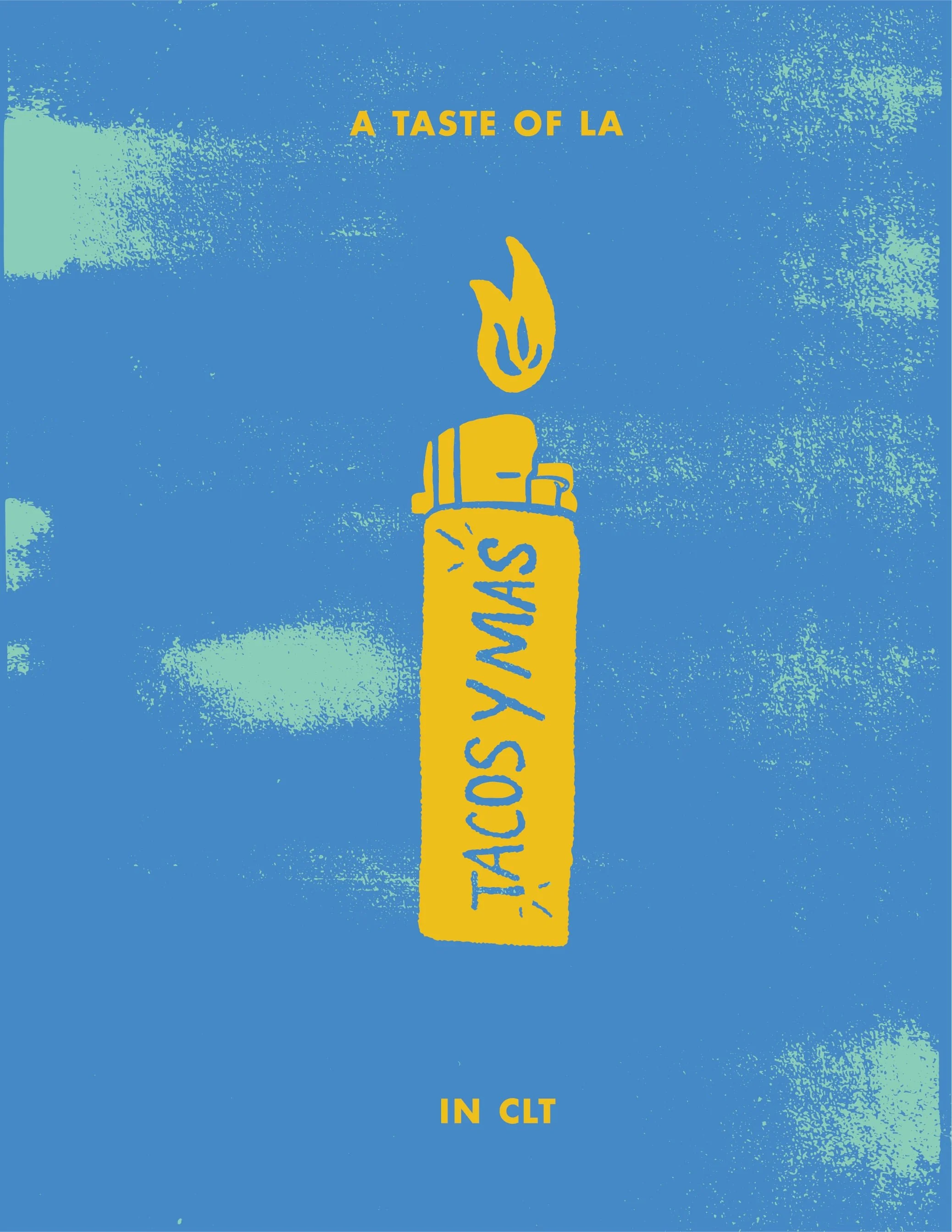
As we developed the Chilito brand identity, we drew much inspiration from the fun and playful yet passionate and sincere founders. With Los Angeles, California roots and a love for grunge vibes, we established a bright color palette, and fun illustrations that represented the hip LA culture and the key ingredients their delicious food was made from.
SERVICES
Art Direction, Brand Strategy, Brand Identity, Collateral Design, Packaging